Most applications use more than the standard controls. Many businesses have business practices that makes them unique, so they want these practices implemented in the software, but standard controls are typically too limited or have issues. A good example would be the UWP CheckBox. If you do some research, you will find developers having issues customizing the standard UWP CheckBox so you might want your own check box.
To create a custom native UWP control is actually a very simple process.
Right click on the UWP project, and select Add Item
In the Add New Item Window, Select “Templated Control” and give it a name for your custom control. After giving your control a name, click the Add button so Visual Studio add the file(s) to your project.
Visual Studio will create a new cs file in the root of your project using the name you gave it in the Add New Item Window. In my example, it added “CustomCheckBox.cs”. The class will be a simple class initially with it setting the DefaultStyleKey in the constructor.
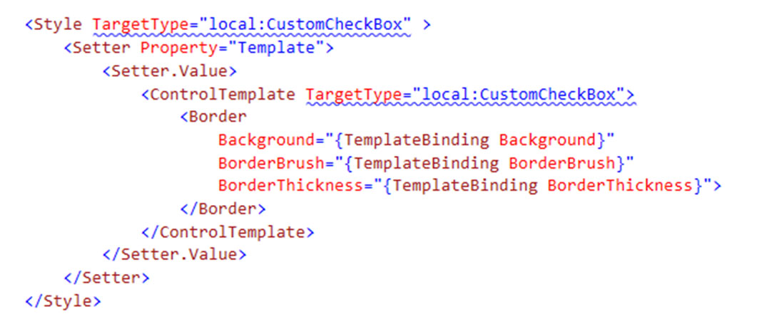
Under a folder “Themes”, you will see a file “Generic.xaml” which holds the basic style and control template.
If you want to have custom properties to use in XAML for your app, then you need to implement the properties as Bindable Properties. Visual Studio has a code snippet for adding Bindable Properties. In your cs file (my file is CustomCheckBox.cs), type “propdp” and hit the tab key twice. Visual Studio will add some code to your class with default type of int and named “MyProperty” with the property type, name, name of the class and default value highlighted.
You can change the different highlighted options and press the tab key to go from one highlighted option to another. In my case, I wanted a string property named “Text” with a default empty string as the default value.
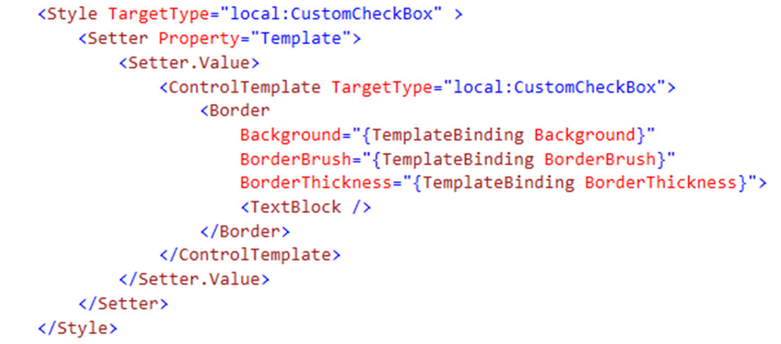
In the “Generic.xaml” file, now we need to add a text block to print the label for my custom check box. I will add it inside the border.
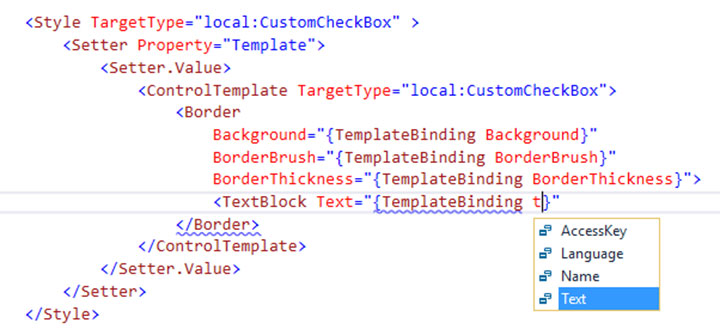
To get the TextBlock to show the value in our new bindable property, we will give it a “TemplateBinding” and as you are typing in the name, intelliSense will give you a list of bindable properties in your new control. As you can see below, my new “Text” property is on the list.
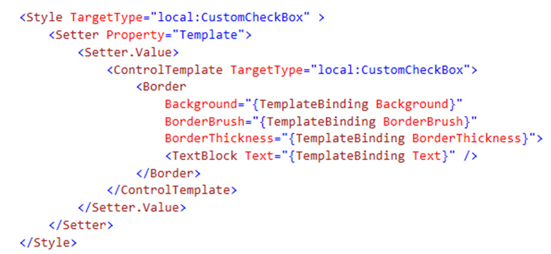
At this point, our new custom control has a text block with a binding to the Text property in it that will show on the screen whatever string that we put into the XAML when using the control in our project.
To use your custom control in the XAML of your page/control, you will need to declare a namespace to it. If you app was “CustomUWPControl”, then you would add a xmlns of
xmlns:ctrl=”using:CustomUWPControl”
After declaring the namespace, you can use the control in your XAML just like any other control. For my control, I would add
<ctrl:CustomCheckBox Text=”Jeff Wyzard”/>
If you run your app with the new control, you will see the text block with your Text string displayed on the screen.
The ControlTemplate in the “Generic.xaml” can have most any XAML controls or layout that you would want as if you were drawing it out in the xaml of your app. So, you could be a Grid with multiple rows, you can use an Ellipse or other shape methods, etc. in your ControlTemplate to produce a reusable custom control for UWP.
Have fun!
Code is available on my Github at https://github.com/jwyzard/CustomUWPControl
Follow me online to learn about creating custom native controls in Xamarin Android and iOS plus Xamarin Forms custom view that uses these custom native controls.
My Blog: www.wyzard.us
LinkedIn: https://www.linkedin.com/in/jeff-wyzard-b89a7011


