A lot of apps need more customized UI that what is available with the current set of controls. Today we’ll add a customized Check Box control since the Android Check Box has some limitation.
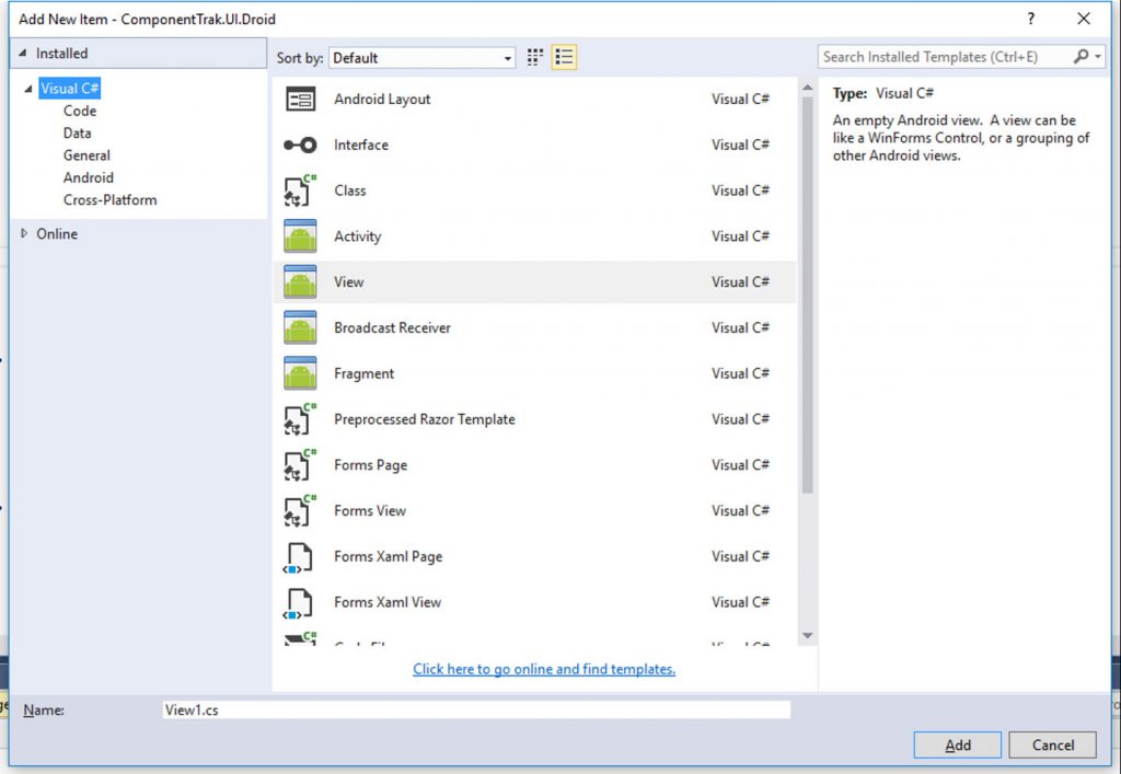
Right click on your Xamarin Android project and select Add Item.
In the Add New Item Window, select “View” and give it a name for your custom control. After giving your control a name, click the Add button so Visual Studio add the file(s) to your project.
Add a line to register the new control with an attribute on the class that registers the namespace plus name of the control.
[Register(“ComponentTrak.UI.Droid.TrakCheckBox”)]
public class TrakCheckBox : View
{
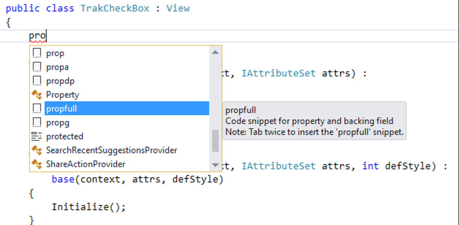
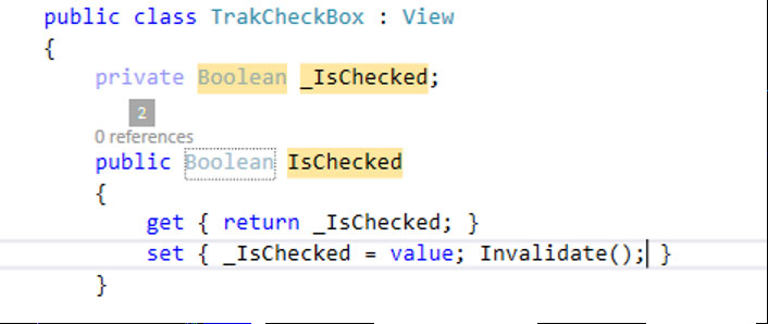
Now we will add any properties that we’ll need for customizing our new control and we’ll use the Visual Studio code snippet “propfull”. In the class, type propfull and hit the tab key twice.
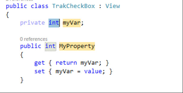
Visual Studio will add some code to your class with default type of int and named “MyProperty” with the property type, name, name of the class and default value highlighted
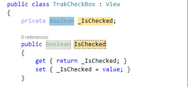
You can change the different highlighted options and press the tab key to go from one highlighted option to another. In my case, I wanted a Boolean property named “IsChecked” with a default false as the default value.
For Xamarin Android controls, if the property will be changing something on the screen then you will need to tell the View to refresh by calling Invalidate(); method on the set of the new property.
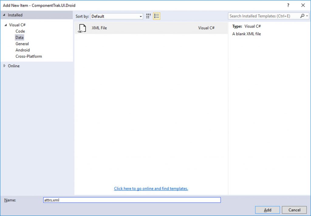
If you do not have an attrs.xml file in the Resources/Values folder then you will need to add a new XML file by right clicking on the Values folder and selecting Add New Item. In the Add New Item window, select Data on the left and XML File in the middle. Give the new XML File a name of “attrs.xml” and click the Add button.
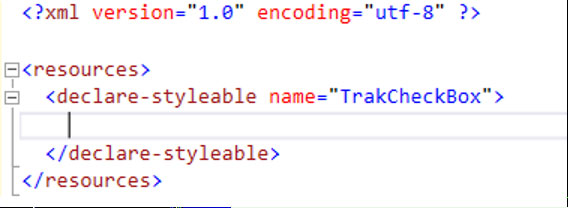
In the new XML file, we need to define the properties that we’ll be using to customize the new control. First we’ll need to add a tag of “resources” and inside the resources tag, we’ll need to add a tag of “declare-styleable”. The declare-styleable tag will need an attribute of name that is the name of the new control.
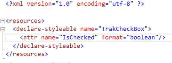
Inside the declare-styleable, we will add a line for each of our custom properties. So we’ll add a attr tag with attributes of name and format. The name attribute is the name of the property and format will be the type of property.
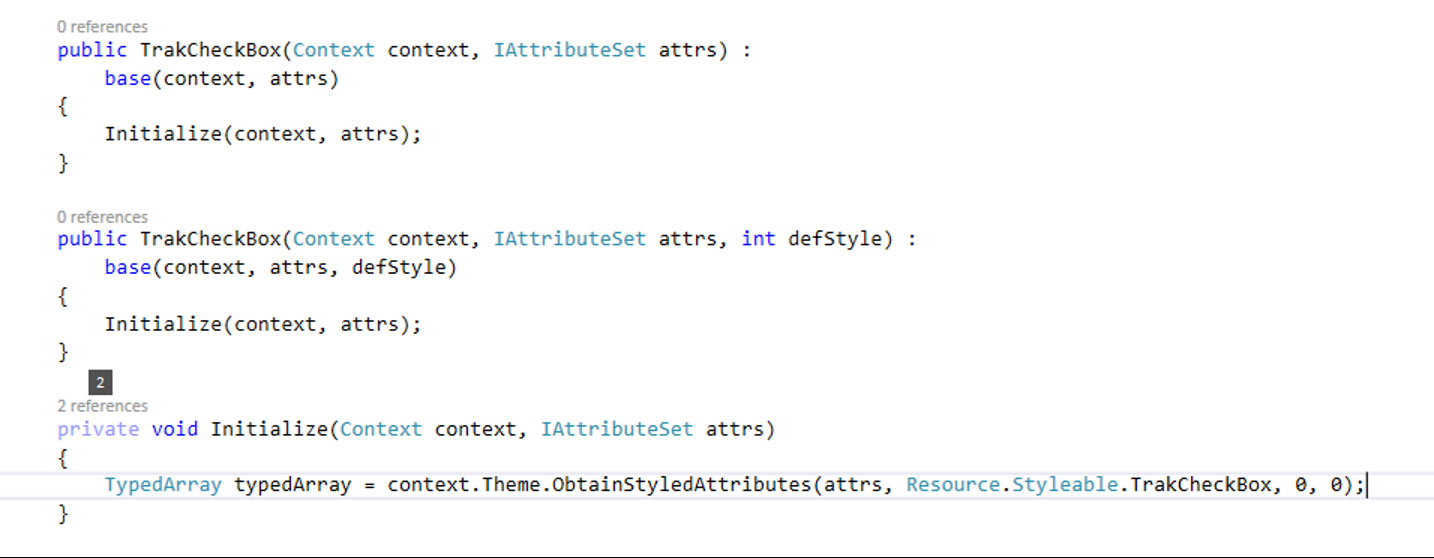
In the constructor of the new control/view, we will need to get the values. I perform this in the Initialize method and pass the context and attrs into the Initialize method. Using the context and attrs variables that are passed into the constructor, we obtain an array of the property values. Use the context, obtain a styled attribute and the method will return a TypedArray.
Next we’ll get the value if defined in the layout and we’ll give the method a default value so if the control property is not given a value in the layout. Using the typedArray instance that we call a Get method based on the type. In my example, I’ll call GetBoolean to get the boolean value for the IsChecked property.
After getting the values, we need to call recycle.
Now we can start drawing portion of the custom control. Type override and select the OnDraw method with the Canvas argument since we’ll need to override the OnDraw method for the drawing.
Next in the OnDraw, we can draw the box for our check box control.
You can do whatever you need to do in the Draw method to create your custom control.
Have fun!
Follow me online to learn about creating custom native controls in Xamarin and iOS plus Xamarin Forms custom view that uses these custom native controls.
Follow me
My Blog: www.wyzard.us
LinkedIn: https://www.linkedin.com/in/jeff-wyzard-b89a7011
